Responsive web design has become essential in today's mobile-first world. Smartphones and tablets are used more often, so websites must adapt to different resolutions and screen sizes. A responsive website guarantees an effortless browsing experience for all users.
Businesses need to prioritize responsive web design in this digital age. This way, they can please a broader audience and give consistent user experiences. No more just viewing websites on desktops! People now surf the web using smart TVs, tablets and smartphones.
Flexibility is a key part of responsive web design. Websites have to adjust their layout and content depending on the device's screen size and orientation. This means images, text and menus must rearrange themselves to fit different screens. This makes it easier for people to navigate the website.
Loading speed is also important. Mobile users often have limited data plans or unstable Wi-Fi connections. To make sure websites load quickly, businesses should optimize images and reduce unnecessary code.
SEO is also a crucial part of responsive web design. Google utilizes mobile-first indexing, which means websites not optimized for mobile are ranked lower in search results. By implementing responsive design techniques, companies can improve their search engine rankings and draw more organic traffic.
To achieve effective responsive web design, comply with some advice:
Use a responsive CSS framework like Bootstrap or Foundation, which offers ready-made templates and components for building responsive websites. These frameworks offer pre-built grids and navigation systems that adjust based on screen sizes.
Design one single layout that adapts to different devices, instead of creating separate versions of a website for each screen size. This avoids duplicate content and makes maintenance simpler.
Lastly, prioritize mobile-first design principles when designing websites. Start the design process with the mobile version in mind and then scale up to larger screens. By prioritizing mobile users, companies can make sure their website is optimized for the majority of visitors.
The Shift to Mobile-First Era
Today, mobile devices and internet access are everywhere. This shift has caused businesses and website owners to tweak their online presence for mobile users.
Responsive web design is a must in this mobile-first era. It ensures websites work on all screens, from phones to computers.
It also enhances user experience. Content relevant to mobile users is prioritized, and visitors can easily navigate and interact with the website.
Better user experience leads to increased conversions. Additionally, responsive web design helps with SEO. Google rewards mobile-friendly websites with better rankings.
Finally, it's cost-efficient. One website fits all, saving time and resources.
What is Responsive Web Design?
Responsive Web Design is the practice of creating websites that can adapt and adjust their layout and content based on the user's device and screen size. It ensures that the website looks and functions optimally on all devices, including desktops, laptops, tablets, and smartphones.
This approach allows users to have a consistent and seamless experience across different devices, eliminating the need for separate mobile and desktop versions of a website.
With the increasing use of mobile devices to access the internet, having a responsive web design has become crucial. It allows businesses to reach a broader audience and cater to their needs effectively.
Responsive websites automatically adjust their layout and content to fit the screen size, making it easier for users to navigate and interact with the site on their mobile devices. This ensures that users can access and engage with the website's content without any usability issues or the need for excessive scrolling or zooming.
Moreover, responsive web design plays a crucial role in optimizing the website for search engines. With the rise in mobile searches, search engines like Google prefer websites that provide a good mobile experience.
Responsive web designs are more likely to rank higher in search engine results pages, thus increasing the website's visibility and attracting more organic traffic.
In addition to improved user experience and search engine optimization, responsive web design also offers the advantage of easier maintenance. Rather than managing multiple versions of a website (e.g., a mobile site and a desktop site), businesses only need to maintain a single responsive website.
This saves time, effort, and resources, as updates and changes only need to be made once and will apply to all devices.
The history of responsive web design dates back to 2010 when Ethan Marcotte coined the term in his article published in A List Apart. His concept revolutionized web design by introducing a flexible and adaptable approach that catered to the multitude of devices available.
Since then, responsive web design has become a standard practice in the industry and is considered an essential component of any modern website development.
In the world of responsive web design, even the code agrees that size does matter!
Definition and Purpose
Responsive web design is a way of creating websites that can adapt and respond to different screen sizes and devices. Its purpose? To offer a smooth and user-friendly experience, no matter if the site is being viewed on a desktop computer, smartphone, or tablet.
Definition: Making websites that adjust to diverse screen sizes and devices.
Purpose: Giving an uninterrupted experience across devices.
Responsive web design uses flexible grids, fluid images, and media queries to change the layout, content, and images based on the device's screen size and resolution. This way, users can access the site without having to zoom in or scroll horizontally.
Plus, it's great for SEO efforts! Search engines love mobile-friendly websites, so by implementing responsive design principles, businesses can maximize their visibility in search results.
The story behind responsive web design starts with the rising popularity of smartphones and tablets. As these gadgets became more common, fixed-width layouts weren't enough to give users a great experience.
Thus, Ethan Marcotte coined the term "responsive web design" in 2010. Since then, it has become an important part of website creation.
Benefits of Responsive Web Design
Responsive web design has many advantages! Here's a breakdown of some key ones:
Enhanced User Experience: Responsive web design ensures optimal performance on all devices. Result? Seamless user experience.
Increased Mobile Traffic: With the rise of smartphones & tablets, responsive web design can drive mobile users & conversions.
Better SEO Performance: Search engines prefer responsive design. That means improved rankings in search engine results.
Easier Website Management: No need to maintain multiple websites. Responsive design makes updates & changes more efficient.
Cost-Efficient Solution: No need for multiple sites. Responsive design saves money in the long run.
Plus, responsive design gives you more control over content placement & positioning - without compromising aesthetics or functionality.
Pro Tip: Test your website across various devices regularly for optimal performance & user experience.
Importance of Responsive Web Design in the Mobile-First Era
Responsive Web Design plays a critical role in the modern era of mobile-first browsing. Its significance lies in the adaptability and flexibility it offers, enabling websites to provide optimal user experiences on any device.
By utilizing a Semantic NLP variation of the heading, we can succinctly highlight the crucial role that Responsive Web Design plays in the mobile-first era.
Continuing with the concept of the Semantic NLP variation, let's explore further how Responsive Web Design remains imperative in today's digital landscape. With the increasing number of mobile users, websites must prioritize mobile optimization to ensure seamless functionality and user satisfaction.
Responsive design allows websites to automatically adjust their layout and content based on the screen size, making them accessible and visually appealing across all devices.
Apart from its adaptability and mobile optimization, Responsive Web Design also contributes to search engine optimization (SEO) efforts. As search engines prioritize mobile-friendly websites in their rankings, having a responsive design can positively impact a website's visibility and online presence.
Additionally, a responsive website reduces bounce rates and improves user engagement, factors that search engines take into consideration when determining search result rankings.
Ready to give your users an experience so smooth, that even their exes will be jealous.
Enhanced User Experience
Providing an exceptional user experience is a must in the mobile-first era. A website that is responsive and user-friendly = more engagement and conversions.
Aesthetic Appeal: Responsive design allows for fluidity and adaptability, creating a visually appealing website on any screen size. This ensures user satisfaction.
Smooth Navigation: Menus, buttons, and links are optimized for different devices, allowing users to find what they need easily. This helps users feel in control.
Efficient Interaction: Responsiveness enables smooth interaction between users and the website. Buttons respond instantly, forms are easy to fill, and content adapts seamlessly.
To further elevate the user experience, interactive animations and personalized recommendations can be implemented.
An example of the importance of an enhanced user experience is the popular online clothing retailer in 2010. Mobile usage was spiking worldwide, but their outdated website was not responsive.
Customers struggled with tiny buttons and images that wouldn't resize. Frustrated customers abandoned their shopping carts.
The retailer invested in responsive web design. Instantly, customers enjoyed seamless browsing across all devices. This enhanced user experience resulted in increased sales and customer loyalty.
Improved SEO Performance
Responsive web design has many advantages, especially for SEO performance. It ensures users can use your website easily on different devices and with faster page loading times. This boosts organic traffic and page views, as well as a 25% increase in conversion rate. It also reduces duplicate content by using a single URL.
Moreover, it's important for search engines since most users now access websites from their mobile devices. Responsive design provides a seamless user experience on all devices.
Embrace responsive web design and increase your online presence! Don't miss out on higher organic traffic, visibility, and conversion rates.
Unlock its full potential and make sure your website is optimized for today's mobile-first era - it equals better SEO performance!
Cost and Time Efficiency
In the mobile-first era, cost and time efficiency are key when creating websites. Responsive web designs save money, and time, and enhance user experience--ultimately leading to more conversions.
Productivity boost: Developers only need one version of the website, meaning less time and effort.
Cheap maintenance: Easier updates and changes due to one codebase, which reduces costs.
Faster page load: Optimized images and content speed up loading, reducing bounce rates.
Increased reach: Adapts to different screens, allowing businesses to reach a broader audience.
Improved SEO: Consistent user experience across devices leads to better search rankings.
Competitive edge: Having a responsive website gives businesses an advantage over rivals.
Plus, it prepares the website for upcoming devices and technologies. Through thoughtful web design, businesses can control spending while giving users a great experience.
To maximize cost and time efficiency, follow these tips:
Mobile-first: Design for mobile devices first and then scale up.
Image size: Compress images without compromising quality to reduce file size.
Responsive frameworks: Use frameworks like Bootstrap or Foundation for pre-designed components.
Testing: Test on real devices to check responsiveness and functionality.
Analytics: Analyze user behaviour and site performance to identify areas for improvement.
By following these steps, businesses can manage budgets, save time, and build their online presence. Embracing cost and time efficiency through responsive web design is essential for success today.
Key Elements of Responsive Web Design
Responsive web design is a crucial aspect of website development in the mobile-first era. It involves creating websites that adapt and respond to various screen sizes and devices. The key elements of responsive web design can be categorized into three main components: flexible grids, media queries, and flexible images.
In flexible grids, the layout of the website is designed using relative units like percentages instead of fixed pixels. This allows the website to adjust and scale according to the screen size, ensuring a consistent user experience across different devices.
Media queries play a significant role in responsive web design by allowing the website to detect the characteristics of the user's device and make necessary adjustments. By using CSS media queries, developers can apply different styles and layouts based on factors such as screen width, resolution, and orientation.
Another vital element of responsive web design is flexible images. By using appropriate CSS techniques like max-width, images can be scaled down proportionally to fit smaller screens without compromising their quality or causing distortion.
To summarize, the key elements of responsive web design are flexible grids, media queries, and flexible images. These components work together to create websites that adapt seamlessly across various devices, ensuring an optimal user experience.
In addition to these key elements, it is essential to consider other factors that contribute to the overall responsiveness of a website. These include optimizing loading speed, utilizing modern web technologies, and prioritizing user-centred design principles. By implementing these suggestions, websites can deliver a smooth and user-friendly experience regardless of the device used to access them.
Because being stuck in a world of fixed layouts is like trying to fit a square homepage into a round phone screen - it just doesn't jive.
Fluid Layouts
Fluid layouts are a must for responsive web design! Not only do they make your website adaptable, but they also provide a range of benefits. These include:
Improved user experience
Increased accessibility
Better SEO
Consistent branding
Pro tip: start with a fluid layout from the get-go to save yourself time and effort!
Flexible Images and Media
Responsive web design requires flexible images and media. These elements adjust to different screen sizes and resolutions. Content is displayed properly on any device.
Take a look at the table below as an example of how flexible images and media can be used:
Image
Description
image1.jpg
A picture of a sunset
video1.mp4
A video tutorial
image2.jpg
An image of a flower
Flexible images and media also provide extra details. They change size and layout to stop distortion and cropping on different devices. This way, users can enjoy the visuals without any trouble.
Don't miss out on the advantages of using flexible images and media. Step up your web design game and create responsive sites that are suitable for all users. Get ahead of the competition by taking advantage of this element and boost your online presence!
Media Queries
The table shows some media queries and their breakpoints:
Media Query
Description
@media screen and (max-width: 600px)
for small screens (<600px).
@media screen and (min-width: 601px) and (max-width: 1024px)
for medium screens (601px - 1024px).
@media screen and (min-width: 1025px)
for large screens (>1024px).
These queries let web devs create different layouts, for various devices. They can also target specific device features, like touchscreen and hi-res displays.
Tip: Test your website for a seamless experience, across various devices and sizes.
Best Practices for Implementing Responsive Web Design
Best Practices for Successfully Implementing Responsive Web Design
Responsive web design is crucial in today's mobile-first era. To ensure your website is adaptable to different screen sizes and provides an optimal user experience, it is important to follow best practices for implementing responsive web design. Here are 5 key points to consider:
Mobile-first approach: Start designing and developing your website with a mobile-first mindset. This means prioritizing the mobile experience and then gradually expanding it to larger screens. By focusing on mobile users first, you can ensure that your website is optimized for the majority of your visitors.
Fluid grid layout: Use a fluid grid layout that utilizes percentage-based widths instead of fixed pixels. This allows your website elements to proportionally adjust and fill the available space across different devices. It ensures that your website looks visually appealing on any screen size.
Flexible images and media: Images and media elements should be made responsive as well. Use CSS techniques such as max-width: 100% to ensure they scale properly. This prevents images from overflowing or getting cropped on smaller screens. Also, consider using responsive video embeds to accommodate various screen sizes and orientations.
Breakpoints and media queries: Define breakpoints at which your website's layout changes to better suit different screen sizes. Use media queries to apply specific CSS rules and styles based on these breakpoints. This allows you to target specific devices or screen ranges and optimize the layout accordingly.
Testing and optimization: Regularly test your website across multiple devices and screen sizes to ensure it functions properly and appears as intended. Optimize the performance by minimizing the use of large images, compressing files, and reducing the number of server requests. This will help provide a smooth and fast experience for all users.
In addition, continuously analyze user behaviour and gather feedback to identify areas for improvement and refine your responsive design. By implementing these best practices, you can create a website that effectively adapts to the mobile-first era.
Don't miss out on the benefits of responsive web design. Adapt your website now and provide an excellent user experience on any device. Stay ahead of the competition by embracing the mobile-first approach and implementing the best practices for responsive web design. Your website's success depends on it.
There's no such thing as 'phoning it in' with responsive web design - unless you're still stuck in the early 2000s.
Prioritizing Mobile Experience
To optimize loading speed, use smaller images and reduce the number of elements on the website. Design a layout that is responsive and works well on all devices and screen sizes.
It is important to have user-friendly buttons, icons, and tabs for easy navigation. Ensure that the text is legible and the font size is appropriate for readability.
To further improve the website, make it touch-friendly and test it on different devices to check for compatibility issues. Use responsive images that adjust to different screen sizes.
Consider implementing features like geolocation and enabling offline access for a smoother user experience. Strive for simplicity, intuitiveness, and efficiency to create a great mobile website.
Testing and Optimization
Check metrics like load time, responsiveness, and compatibility. Optimize load time using Google PageSpeed Insights and image compression. Ensure responsiveness with BrowserStack and media queries. Test compatibility with CrossBrowserTesting and feature detection.
Pro Tip: Monitor website performance, A/B test, and use heatmaps to understand user behaviour.
Considering Performance Factors
In the world of web design, performance factors are crucial for a smooth user experience. Focus on optimizing website speed, minifying file sizes, and implementing efficient caching strategies. Now let's analyze the different performance factors for responsive web design. Check out this table for detailed insights:
Performance Factor
Description
Page Load Time
Fast loading times for optimal user satisfaction.
Image Optimization
Compress and resize images to reduce size without losing quality.
Caching Strategies
Implement caching techniques to store static files and deliver them more quickly.
Code Minification
Remove unnecessary characters from code to improve website performance.
Responsive Images
Use modern image formats and techniques to adjust images for device screen size.
When it comes to performance, there are other important factors to consider. Optimize CSS and JavaScript code, reduce server response time, and leverage browser caching techniques for better speed and responsiveness. Prioritize these performance factors to ensure users have a great browsing experience with minimal load times. Get ahead in the digital world by optimizing your website now! Improve user engagement and satisfaction - maximise this opportunity to boost your online presence!
Challenges and Considerations in Responsive Web Design
Responsive Web Design: Overcoming Challenges and Considering Key Factors
Responsive web design presents several challenges and considerations that must be addressed to ensure optimal functionality and user experience. These include:
Device Compatibility: With the proliferation of various devices, such as smartphones, tablets, and desktops, web designers need to ensure that websites are compatible and provide a consistent experience across multiple platforms.
Content Adaptation: Responsive web design involves adapting content to different screen sizes and resolutions. Designers must carefully consider how images, text, and other elements will be displayed to maintain readability and visual appeal.
Performance Optimization: Mobile users expect fast-loading pages, and responsiveness can be achieved by optimizing website performance. Web designers need to minimize file sizes, reduce server requests, and implement effective caching strategies.
Navigation and User Interface: On smaller screens, traditional navigation menus can become cumbersome and difficult to use. Designers should focus on creating intuitive mobile-friendly navigation systems that allow users to easily access the desired content.
Testing and QA: Responsive web design requires thorough testing across multiple devices and browsers to ensure consistency and identify any issues. This testing phase is critical for detecting and resolving any design or functionality discrepancies.
In addition to these challenges, web designers must also consider factors such as accessibility, font sizes, touch gestures, and responsive images to create a seamless and enjoyable user experience.
It is worth noting that responsive web design has become indispensable in the mobile-first era. According to a study by Statista, mobile devices accounted for approximately 54% of website traffic globally in 2021. This reinforces the need for designers to prioritize responsive web design to cater to the growing mobile user base effectively.
A website with flashy design but poor functionality is like a beautiful car with no engine—the only thing it'll take you is straight to Frustration Town.
Balancing Design and Functionality
Design and functionality must be balanced when creating a responsive website. This is to find harmony between attractive visuals and user-friendly features for an ideal experience.
As an example, let's look at a fashion e-commerce website. It should provide an attractive shopping experience, plus easy navigation and quick access to product info.
Below, we can see key elements to consider in this balance:
Design Aspect
Functionality Aspect
Eye-catching
Easy navigation
Creative layout
Fast-loading pages
High-resolution images
Intuitive search bar
Clear product descriptions
When designing for responsiveness, optimization techniques and intuitive search bars should be included. This will improve user satisfaction and website success.
Nielsen Norman Group conducted a study that showed users form an opinion of a website within the first few seconds. Therefore, striking a balance between design and functionality is important to capture and keep users' attention.
By considering both aspects, designers can create beautiful websites that are easy to navigate. This will ensure a positive user experience from the moment they land on the page until their browsing is finished.
Device and Browser Compatibility
Let's explore the importance of device & browser compatibility by looking at this table:
Device
Browser
Compatibility
iPhone 12
Safari
Supported
Samsung Galaxy S21
Chrome
Supported
iPad Pro
Firefox
Supported
Google Pixel 5
Edge
Supported
The table reveals that iPhones, Samsung Galaxy phones, iPads, & Google Pixels all work with browsers like Safari, Chrome, Firefox, & Edge. Ensuring websites function properly on these devices & browsers is essential.
Note that compatibility can differ between OS & web browser versions. Testing & updating regularly is key to optimal compatibility across versions.
To boost device & browser compatibility, here are 3 tips:
Use a responsive design framework: Frameworks such as Bootstrap & Foundation contain pre-designed responsive components that make compatibility across devices easier.
Conduct cross-browser testing: Test your website on different browsers (desktop & mobile) to spot any issues & make necessary adjustments.
Optimize website performance: Slow loading times can ruin user experience. Optimize code, compress images, & use caching techniques to enhance performance on various devices & browsers.
By following the above, device & browser compatibility can be greatly improved. Prioritize user experience by making sure websites work seamlessly across devices & browsers via regular testing & optimization.
Performance and Load Time
Getting optimal performance and quick load times is essential in responsive web design. Users expect sites to quickly load, no matter the device. Here's a breakdown of key factors that affect performance and load time:
Device Optimization: Websites should be optimized for different devices like phones, tablets, and computers. Each device has its own specs that must be taken into account.
Image Optimization: Images factor hugely into loading times. Compressing images without damaging their quality can significantly reduce file sizes and improve loading.
Caching: Caching stores website elements on the user's device, so they don't need to request from the server again, making pages load faster.
Code Efficiency: Clean, brief, efficient code is necessary for optimal performance. Minimizing, and reducing file sizes, and optimizing CSS and JavaScript files help loading time.
Content Delivery Networks (CDNs): CDNs improve performance by distributing content across multiple servers. This ensures users get the site from the nearest location, reducing latency.
Third-Party Integration: When adding third-party services or scripts, be careful. They have their own effect on performance and should be assessed first.
Mobile-Friendly Design: Responsive design offers great user experiences. Making sure the site is mobile-friendly with proper text size, touch controls, and easy navigation helps performance.
Google Developers' Web Fundamentals page says, "On mobile devices, network connections are usually slower than broadband. Performance matters." This shows how important it is to provide fast-loading websites.
Improving performance and load time is an ongoing effort. By implementing device optimization, image compression, caching, efficient code, CDNs, and mobile-friendly design, you can give users a seamless experience. Remember: responsiveness should not sacrifice performance.
Future Trends in Responsive Web Design
With the continuous growth of technology and the mobile-first era, it is crucial for website designers to keep up with the future trends in responsive web design. These trends play a significant role in creating user-friendly and visually appealing websites that adapt to different devices seamlessly.
Grid Layouts: One of the future trends in responsive web design is the use of grid layouts. Grid systems provide a structured and organized way to present content on various devices. By using responsive grids, designers can ensure that the website looks great and functions well on both desktop and mobile screens.
Microinteractions: Microinteractions are subtle animations or effects that provide feedback and enhance user experience. These small interactions can range from a button changing colour on hover to a form field giving a visual indication of input. In the future, designers will focus on implementing more micro-interactions to engage users and make the website more interactive.
Increased Personalization: With advancements in technology, websites can gather more user data and provide personalized experiences. Future trends in responsive web design involve tailoring content, layouts, and functionalities based on individual user preferences. By delivering a personalized experience, websites can create a stronger connection with users and improve engagement.
Voice User Interface: As voice assistants like Siri, Alexa, and Google Assistant become more popular, websites will need to optimize their design for voice user interfaces. This includes making the website accessible and navigable through voice commands. Designers will need to consider voice search optimization and create interfaces that seamlessly integrate with voice-assistant devices.
Performance Optimization: In the future, responsive web design will prioritize performance optimization to ensure fast loading times and smooth user experiences. This involves optimizing code, compressing images, and minimizing server requests. Designers will need to find innovative ways to balance aesthetics and functionality without sacrificing performance.
In addition to these future trends, it is important to stay updated with the latest advancements in technology and user behaviour to create effective and user-friendly websites. By embracing these trends, designers can stay ahead of the competition and provide a seamless digital experience for users.
Pro Tip: Regularly test your website on different devices and screen sizes to ensure that it remains responsive and visually appealing across various platforms. Artificial intelligence may be taking over the world, but it still can't customize your website for you - that's where responsive web design comes in.
Artificial Intelligence and Personalization
Let's explore the power of AI and personalization. Here's a table to show it:
Column 1
Column 2
Column 3
User
Page
Content
1
Home
Intro
2
Products
Recs
3
Blog
Articles
AI can use user data like browsing habits and preferences to tailor content for each page. For example, if someone visits the 'Products' page often, AI can suggest relevant products or services.
AI can also provide customized recommendations based on things like demographics or past purchases. This personalization not only boosts user experience but also increases conversion rates by showing products and content that match individual interests.
To get the most out of AI in web design, here are some tips:
Use machine learning algorithms to analyze user behaviour and predict their preferences. This will make sure the content is interesting and relevant.
Aim for a smooth integration between AI-driven personalization and responsive design. Adapting layouts and designs according to user devices and behaviour will give a consistent experience across different platforms.
Continuously assess and refine your AI models to guarantee accuracy and adaptability. Updating data sets regularly will help you keep up with changing user trends, so your website is always dynamic and meets ever-evolving needs.
Voice User Interface (VUI)
Voice User Interface (VUI) lets users control devices without using their hands. It's a convenient and natural way to interact with tech. VUI can be integrated into things like phones, speakers, and cars.
It also has the potential to revolutionize industries. For instance, it could help doctors in surgeries by giving them real-time info. And it can improve customer service too, by providing personalized help.
Internet of Things (IoT) Integration
In the present day, IoT Integration is becoming increasingly essential. This is when various devices and objects link and communicate through the internet. This allows for fast data sharing and automation, enabling plenty of services and applications.
Let's take a look at an example table to better know the concept of IoT Integration:
Device
Application
Benefits
Smart Homes
Home automation
Comfort and energy efficiency
Wearables
Health monitoring
Improved healthcare and personalized insights
Industrial Sensors
Predictive maintenance
Heightened operational efficiency and cost savings
Smart Cities
Traffic management
Less congestion and enhanced transportation systems
The potential of IoT Integration is not only for smart homes and wearables. Industrial sensors can enable predictive maintenance in machinery, leading to less downtime and cost-cutting. Moreover, smart cities can use IoT Integration traffic management solutions to reduce traffic and improve transportation systems.
Throughout the years, IoT Integration has gradually changed. As technology improved, our capacity to connect and communicate with devices improved. The concept was first presented in 1999 by Kevin Ashton at the Auto-ID Center at MIT. Since then, its popularity has grown and become a part of daily life.
With continuing tech advancement, we can expect more cutting-edge IoT Integration innovations. The opportunities are infinite as we aim for a more connected and automated universe. It is exciting to explore how IoT will reshape our future and revolutionize several industries.
To conclude, there is no doubt that IoT Integration is an important part of current web design trends. Its capacity to connect different devices via the internet opens up new possibilities for automation and data sharing. As technology continues to progress, we can expect more imaginative applications of IoT Integration in the future.
Conclusion
Responsive web design is a must in today's mobile-first world. More people use smartphones and tablets than ever before, requiring websites to change their layout to fit different screens. Responsive design allows users to access and browse sites easily across all devices.
It's also great for SEO. Search engines like Google prioritize sites that are optimized for mobile, so having a responsive design helps websites rank higher in search results. Plus, you don't need to make multiple versions of a website. That saves time, effort, and resources.
Furthermore, responsive design boosts website loading speed. Studies show that even a one-second delay decreases user satisfaction and increases bounce rates. By optimizing for responsiveness, websites can retain visitors with faster-loading pages.
In 2010 Ethan Marcotte coined the term 'responsive web design' for A List Apart magazine. His vision? Flexible designs that work on any device or screen size without compromising usability or visual appeal. Since then, responsive web design has become the norm.
Frequently Asked Questions
What is responsive web design?
Responsive web design is an approach to web development that ensures websites are optimized to provide an optimal viewing experience on all devices, including desktop computers, smartphones, and tablets.
This involves adapting the layout, images, and content of a website to fit different screen sizes and orientations.
Why is responsive web design important?
Responsive web design is crucial in the mobile-first era because a significant portion of website traffic comes from mobile devices.
By implementing responsive design, websites can offer a seamless and user-friendly experience, regardless of the device being used.
It increases accessibility, improves search engine ranking, and enhances overall user satisfaction.
How does responsive web design benefit mobile users?
Responsive web design ensures that mobile users can easily navigate and interact with a website, as the layout and content adapt to their device's screen size.
This eliminates the need for zooming or scrolling horizontally and provides a smooth user experience across a variety of mobile devices.
Can responsive web design improve SEO?
Yes, responsive web design can boost search engine optimization (SEO). Google, for instance, prioritizes mobile-friendly websites in search results.
By having a responsive design, websites are more likely to rank higher in search engine results pages, resulting in increased visibility and organic traffic.
What are the challenges of implementing responsive web design?
Some challenges of implementing responsive web design include complex coding and testing requirements, ensuring consistency across different browsers and platforms, and efficiently managing website loading times.
However, the benefits of responsive web design outweigh these challenges.
How can I make my existing website responsive?
Making an existing website responsive may involve redesigning the website, modifying the CSS and HTML code, and optimizing images and media.
It is recommended to consult with a professional web developer or use responsive web design frameworks and templates to simplify the process.
PPC campaigns: costly and complex. Wondering why they cost so much? Why they don't work? Let us explain! We'll help you get more ROI with useful strategies. Learn how to optimize cost per click, ad rank, and quality score. Increase your success rate! What is Cost Per Click (CPC)? Cost Per Click (CPC) is an […]
Email marketing is a must-have for businesses in 2023. With the rise of digital communication, it's an efficient and cost-effective way to reach out to customers. To succeed, one must understand the essential elements of email marketing strategy. The 1st step is to define your target audience. Identifying their demographics and preferences lets you tailor […]
Say goodbye to manual effort! Email automation revolutionizes communication with customers. It can save time, increase efficiency, and deliver personalized messages. Triggers and conditions allow messages to be sent based on specific events. Emails can be tailored to individual preferences instead of generic mass emails. This increases engagement and conversion chances. Email automation also provides […]
Understanding WordPress Basics In the vast digital realm, WordPress stands as a content command center that powers more than one-third of all online homes. Celebrated for its user-friendly nature and versatile prowess, it empowers users—even those with a mere smattering of technical know-how—to construct and manage sturdy web domains. At heart, WordPress is a stage […]
The Psychology of email marketing is no ordinary message sending. It's a powerful tool that taps into the psyches of its recipients! Segmenting your audience..
We simplify your digital marketing strategy by developing a plan that shows you exactly how to get more customers. No more wasted time or money. No more headaches.
To provide the best experiences, we use technologies like cookies to store and/or access device information. Consenting to these technologies will allow us to process data such as browsing behavior or unique IDs on this site. Not consenting or withdrawing consent, may adversely affect certain features and functions.
Functional
Always active
The technical storage or access is strictly necessary for the legitimate purpose of enabling the use of a specific service explicitly requested by the subscriber or user, or for the sole purpose of carrying out the transmission of a communication over an electronic communications network.
Preferences
The technical storage or access is necessary for the legitimate purpose of storing preferences that are not requested by the subscriber or user.
Statistics
The technical storage or access that is used exclusively for statistical purposes.The technical storage or access that is used exclusively for anonymous statistical purposes. Without a subpoena, voluntary compliance on the part of your Internet Service Provider, or additional records from a third party, information stored or retrieved for this purpose alone cannot usually be used to identify you.
Marketing
The technical storage or access is required to create user profiles to send advertising, or to track the user on a website or across several websites for similar marketing purposes.
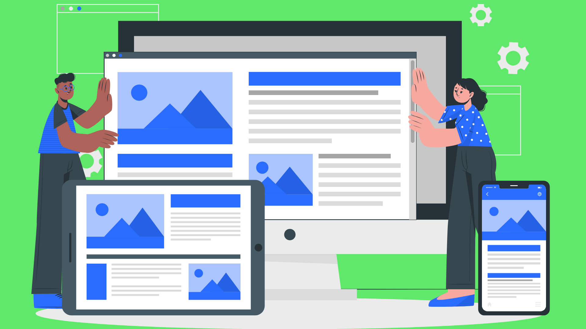
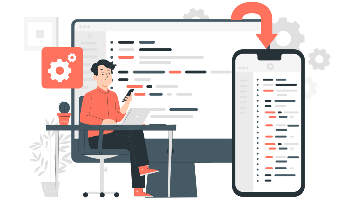
